Saturday, January 24, 2009

Elegance and Inspiration

The inspiration for this card, one of the challenges for last weekend's Crush mini VSN at Splitcoast Stampers, was a vintage chocolate box which you can see and read about here.

The chocolate box, an elaborately decorated and absolutely exquisite Whitman's sampler box, featured a profile of the bust of a woman who has flowing golden hair adorned with a wreath, and the box is decorated in mosaic tiles set in gold. In a word, it's gorgeous.

I just happened to have a scrap of this checked paper from a Debbie Mumm paper stack. It was the perfect paper to recreate the mosaic effect. I briefly -- and I mean briefly -- considered outlining the little squares in gold. When I came to my senses, I decided to put it through the Cuttlebug using the textile folder and then I ran a gold ink pad over the embossing. I used an embossed gold paper for the card base - reminiscent of the metallic gold box cover that was the inspiration piece.

I knew that the subtle gold of the ballerina would be lost against the brilliant gold embossing and bright pink and green of my attempt at making a mosaic panel, so I softened the background with a panel of vellum and edged both the vellum and the patterned paper with gold.

The way I do this is to brush the edges with my large ink pad and then dust them with embossing powder. In this case, I used Versamark and my regular gold embossing powder (not fine detail powder). Once you coat the edges with powder, if there are areas that are too heavy, you can brush a little of the powder off with a paint brush.

I cut the ballerina with a QuicKutz die that I ran through the Cuttlebug using A, B, and C plates. I gilded her with Perfect Pearls. I simply ran the Perfect Medium pad over her and dusted away. The flowers are a two stamp process with a Sugarloaf set (Easter/Spring Collection, #50678). I stamped and embossed the outline stamp for both the blossoms and the leaves in gold and then stamped again with the solid "filler" stamp in pink and green, and added a few blooms just to embellish. The colors I chose for the ink looked like they were made for the paper. (They're from Versafine, and you can find all of the details of all of materials here in my gallery at Splitcoast Stampers.)

The floral heart is a plastic trinket that came with a set of vintage buttons and ornaments. It was originally ivory, but I "painted" it with gold ink. Once it was dry, I simply placed it over the knot and pulled the ribbon tails through the center of it.

The ribbon, from Offray, is an inch and a half wide with gold threading and adds a rich finale to the card.

Friday, January 23, 2009

"Burned Batik" - Not Exactly What it Sounds Like!

One of the challenges at the Crush mini VSN last weekend involved a technique called "Burned Batik". You can see a terrific tutorial written by SCS's Beate Johns here.

This technique involves using a resist or embossing pad to stamp a design which is then clear embossed to form a background design that will not accept ink and will appear white or translucent when ink or paint is applied as a second step.

In the burned batik technique, color is not simply sponged on; instead, the paper is misted and ink is sponged onto damp paper and the effect is the wicking and blending effect one sees in fabric batik. The technique itself is very easy as long as you avoid a few basic pitfalls.

While it's possible to do this technique on good quality card stock, I found that unless you mist sparingly and work quickly, you run the risk of having the top layer of the paper shred while you're sponging on the color and this is almost a sure thing with a lesser grade of card stock. I had the best results and a lovely effect using watercolor paper.

The other place where you can run into difficulty is with the embossing. It's important to over emboss - hence the term "burned" batik. But you don't really want to "burn" or scorch the paper in this technique, which is also easy to do.

So here in a nutshell is the technique:

Using a Versamark or other embossing or resist pad, stamp your image randomly all over your paper. If you look at the paper from an angle under a light, you should easily be able to see where you've stamped and if there are any glaring spaces. But if you miss a spot, don't worry. Once you've embossed, it's very easy to see where you've been, and you can fill in the spaces by inking and embossing a second time.

After you stamp the pattern, cover with clear embossing powder the usual way. I sprinkle it on liberally and then shake and tap it off onto a folded (and open) sheet of paper. Then heat emboss.

When you heat emboss, you want to overdo it a bit. You want to melt the powder as you ordinarily would, but then you want to heat it enough (without singing the paper, of course) to make it bubble and glaze a little bit. (Heck, for me, that's almost normal LOL... I tend to overdo at times....)

You'll know you've probably embossed it enough if the embossing powder gets absorbed a bit into the paper and the image shows through the back of your card stock (sort of like the way grease is absorbed into paper). This happens with card stock but it will not happen with good quality watercolor paper. This is a picture of the back side of the card stock after heat embossing and "burning" the embossing on the front.

Next, spritz the embossed sheet with water. Although any kind of spritzer will do, a mini mister or small mist bottle is easiest to manage. You want a light spray of water to coat the paper, but you don't want to saturate it too much. The paper, especially card stock, will curl and the surface will warp. This is normal and after it's dry, it'll flatten out on its own and if it's still not as flat as you'd like, you can iron it. You will see this to a much less degree (if at all) with heavy watercolor paper.

The next step is to sponge on your color. You can use one or several that work well together. Colors that work well together are those that are close together on the color wheel and would naturally blend together, like blue, green, and lavender, or rose, yellow, and orange. I tried purple and green together, and well, you didn't see a card made with that combination for a reason!

This is where I ran into a problem using what was actually a good quality card stock. I was a little too liberal with the spritzer and my paper was saturated. When I tried to sponge on the color, even gently, the top coat of the paper literally shredded.

This was going to be my attempt at green and purple. As you can see, it was a disaster. I switched to a palette of rose (and rose LOL) and used watercolor paper, and the final result is the beautiful card you see at the top of the page. I embellished the card with a few flowers I had left from another project, and used a fabulous ribbon to finish it off.

I didn't want to detract from the beauty of the technique so I didn't add a busy, hand painted image. What I did was make a small panel with the sentiment using the same technique, mounted both on beautifully coordinating card stock, and used a ribbon to enhance it all. Hope you like my card, and hope you'll try the technique.

Wednesday, January 21, 2009

Shy Kisses - A Limited Supply Challenge

This week’s challenge from Mothers and Daughters Creations is a Limited Supply Challenge. With a Limited Supply Challenge, you are challenged to make a card using certain required elements and at the same time, restricted from using certain tools, techniques, or supplies that may be things you use all the time.

For this week's challenge, you can't use either Nestabilities or your Cuttlebug. (You can’t use a friend’s Cuttlebug either!) In addition to card stock, you may use only one patterned paper and one embellishment. For me, the Queen of Embellishing, that was a tall order! Also, you have to use two stamps and one has to be a sentiment. Whew!

For the "required" elements, I chose an adorable Stampavie image called "For You", a one-word image - "Kisses" - from Imaginisce, card stock from Core'Dinations, and patterned paper from Basic Grey's Granola collection.

I decided that I would tear and distress the edges of my paper since I had to sacrifice any embossing or scallops. I brushed the distressed edges of the card base and the torn edges of the Basic Grey patterned paper with Walnut Stain Distress Ink. I left the torn edges of the blue card stock uninked because I like the light and darker blue contrast in those edges.

Once my image was mounted under the blue “frame”, I punched tiny alternating holes with a 1/16th inch hole punch on the blue card stock and striped patterned paper for the twine. Although I could have “sewn” it with a large needle, it was much easier to thread the twine through punched holes. To make it even easier, I put a tiny drop of dimensional glaze on the end of the piece of twine to make it stiff and prevent the cut ends of the fibers from fraying.

As a finishing touch, to bring out both the blue and the brown in the patterned paper, I off-set the image panel on the card base so that more of the brown card stock showed. I can’t take credit for the curl in the twine; it remained that way after unrolling it from the ball.

Be sure to pop on over to the Mothers and Daughters Challenge Blog and check out the Design Team's cards. Play the challenge and upload a card, and you could a win a wonderful treat from the MDC Store.

Having Fun With "Perfect Pearls"

This is another card I made for last week's CASE challenge at Mothers and Daughters Creations. (See the post just before this one for more information about CASEing cards.)

I “CASED” this card from this card by Lynda Benden in the MDC design gallery. As Lynda did, I used an Outlines image, although instead of the butterfly, I chose one of my favorites, the Sparkle Flower Frame. I kept her basic sketch, modified slightly for a rectangular card. I replaced her short ribbon tail with a satin bow and her round sentiment with a Prisma flower. I used a different lace edge punch to border my central panel, but used a similar polka dotted paper from the Bo Bunny line.

For my card base, used plain ivory card stock and then built my card on a panel of Kosomi card stock from Hanko. I chose this paper because the delicate small floral design compliments the polka dots in the darker panel and the two colors worked well together. Although it may be hard to see in this picture, Kosomi paper is embossed with a tiny pale star shaped flower design arranged geometrically like the polka dots.

I used Ranger’s "Perfect Pearls" to color the images. I love the soft, shimmery effect of the Perfect Pearls. The colors are subtle, perfect for the color shades of the paper I’d chosen. Lynda had embellished her lace border; I chose to embellish the flower frame image instead, and added blue and clear rhinestones.

How to color with Perfect Pearls:

Ranger’s Perfect Pearls has become my new favorite way to color when I want to add shimmery elegance. The colors are subtle, but show up brighter than they did on this card if you use a coated paper like textured or glossy card stock. Applying Perfect Pearls is easy. You can stamp an image using the Perfect Medium in place of ink and then dust the image with the color, or you can color in an image as I did here with a Perfect Medium Pen.

For this paper, I didn’t plan ahead and stamped my image on regular card stock, which has a lot of “tooth” and grabs and holds the powder. I had stamped and embossed my image using Detail Gold embossing powder before I decided to use the Perfect Pearls. Thus, I had to work a little harder than usual to remove the excess pearl powder.

First, color in the design with the colorless Perfect Medium pen. Color only the areas that will be finished in the same color.


Next, using the smaller of the two brushes that comes with the Perfect Pearls kit, lift out a small amount of powder and brush it over the area you’ve covered with the Perfect Medium.


Brush off the excess (if there is a lot, you can brush it onto a piece of paper and tap it back into the canister) with the large brush. In this case, because the paper I used was holding the powder, I had to buff off the extra powder, but the Perfect Medium bonds the Perfect Pearls, so you can actually buff it with a piece of microfiber fabric and the color will remain where you put the Perfect Medium.

Continue to add color, one color at a time, until the entire image is colored. Here it is before I added the rhinestones.

Adding the rhinestones added glitz to glam. I did find, however, that self-adhesive rhinestones don't stick well to the Perfect Pearls. I used a little drop of dimensional adhesive even with self-stick rhinies and that worked like a charm.

Creating Scalloped Oval Note Cards


Last week’s card challenge at Mothers and Daughters Creations was to CASE a card by one of their designers. Depending on the source, to CASE someone’s work means to “Copy And Share Everything” or to “Copy And Selectively Edit”. Whichever description you use, the process is still the same. You use someone’s card or project as inspiration for one of your own and you change at least two things on the card, so it's not a duplicate of the original work.

I love this set of note cards made by Maria Levine.

What I did: I loved the scalloped border but since I don’t have a set of round Nestabilities, I cut my cards with scalloped oval Nestabilities. I used a different palette and different papers, but I used a floral design and layered the ovals to add depth as she did.

How to Make Oval or Round Cards That Open on a Fold:

The goal is to cut a folded card with an oval die placed slightly over the fold so that there is a residual fold left in the card that has been cut in the shape of an oval.


First, score and fold a 5.5” by 8.5” piece of card stock in half to create a card base. Then select three oval dies in serially increasing sizes, with the largest being as close as possible to the size of the card base. Choose designer paper for your card and an image that will be the focal point of your card to coordinate with it.


For this card, I chose this adorable little girl from Stampavie and colored her with watercolor pencils. Because I planned to cut her out and mount her on my card, I only painted the portions of the image that I planned to use in the design – the little girl, two parts of the flower sprigs, and the butterfly.


Using a Cuttlebug and Nestabilities:
Although most any type of cutter/cutting system can be used, I made these cards using a Cuttlebug and Nestabilities, so I am giving instructions for using these tools.

Layer the cover stock or patterned paper you plan to use for the card front under the folded card base and position them on the A and C plates of a Cuttlebug. Place the die perfectly level on the paper with the left edge far enough over the fold to leave 2-3 inches uncut. Cover with a B plate and run through the Cuttlebug. (Note: Ordinarily you would run this through with the die facing up, under the paper, but to try and flip it over makes it almost impossible to get the papers lined of correctly for a perfectly even cut.)

Cut ovals in a contrasting paper and white with the middle and smallest sized oval dies. This paper from Bo Bunny is reversible, and for this card, I used the reverse pattern for my contrasting paper. The paper has a distressed effect and I cut my oval over a portion that had streaks of the contrasting colors running through it.


Punch flower shapes from the scraps of paper with various sized decorative flower punches. With a scrap of olive green, punch 1/8 inch circles and small (1/4”) suns for flower centers, and small leaf shapes.


Arrange blossoms along the bottom curve of the oval. I added the two painted blossoms as well, and then added my image of the little girl. Although it shows up as golden yellow in the photograph, I touched up her kerchief with a gold gel pen – it looks much better in real life! I also added tiny gold dots and flourishes to the punched flower border and glued a small punched flower over the flower she is holding in her hands.

I like a finished look to the inside of my cards and I am always concerned about ribbon tearing through punched holes, so if I am going to thread ribbon through holes in a card (rather than wrap it around a panel), I generally set eyelets. I used two eyelets in a coordinating color for placement of ribbon for a decorative bow.

The finishing touches.

On the inside of the card, I added some punched blossoms and the painted butterfly and embellished them with tiny gold dots and flourishes. Then, I finished the card off by layering two pieces of ribbon tied into a soft bow.

Tuesday, January 13, 2009

Getting Ready for VSN -- Setting up a Work Area

VSN is an intense event in which challenges are posted hourly. You have 45 minutes to complete each individual challenge and then fifteen minutes to neaten your work space, photograph and upload your card, and grab a quick snack. If you’ve made cards for any of SCS's daily challenges, you have some idea of what to expect. The difference is that the VSN challenges have a time restriction and they come one after another. While you don’t have to complete them immediately in the hour after they’re posted, a lot of the fun and excitement of participating in the VSN is to do just that – to work along with everyone else and get each card completed during that hour, before moving on to the next. Unlike daily challenges, with the VSN challenges you are restricted to a 45 minute time frame regardless of when you complete them.

If you do want to challenge yourself to complete each new project as they’re announced, then having an organized work space is key. If you can negotiate an area in your home that will be off-limits to everyone else for the duration of the VSN, you can set up work stations and spread out your craft supplies in a way that will let you work quickly and efficiently. This can make a world of difference with the timed challenges. Before I was blessed with a room in our home dedicated to my crafting, I would commandeer our living room/dining room area to set up a work area. This is one large room and I made use of every table and cabinet surface.

Setting up Your Work Area

After you decide where you are going to set your work space, the first step is to plan out how to lay out and arrange “work stations” for different tasks in a logical way. Bring out the things you use the most – you don’t need to bring out everything you have, just the things you are most likely to use, plus whatever is on the VSN shopping list. This is also a good time to go through and organize your stuff wherever you have it. You’ll rediscover things you might have forgotten you have and they’ll be fresh in your mind for the weekend.

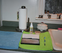
I am manic about cleaning my stamps and paint brushes immediately after I use them and so I set up a stamp cleaning area by the kitchen sink. I love micro fiber towels (you can get packs of 25 at Sam’s Club for a very affordable price). I use them for all kinds of cleaning chores and they are great for drying stamps and blocks. I do use a fair amount of paper towels as well so I make sure that there is a fresh roll on the spindle and extra rolls under the sink. When getting ready for VSN, I set out my stamp and brush cleaners, a stamp cleaning pad, and a soft toothbrush, which is another one of my favorite cleaning tools.

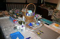
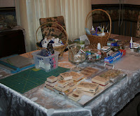
For the Mini Cabaret last fall, I set up a work area in our living room and dining room. I had my husband push the living room furniture to the side and set up a large folding banquet table that I used as a work table where I planned and designed the cards, gathered what I would need for a given card, and painted with watercolors or colored with my Prismacolors. I also set the Cuttlebug up there.

I used the dining room table to set up stations for cutting, stamping, embossing, and assembling the cards, and also set up a “bling bar” on the china cupboard. I’m one of those folks who loves china and fancy things, and how I set up my tables for the VSNs as well as my studio reflects that. When I set up for the Mini VSN, I dug out silver serving trays and baskets and a pretty crystal goblets and bowls. When I moved into my new studio, these things went with me. I think being surrounded by beautiful things enhances my creativity. Certainly, having things organized and neat allows me to stay within the time restrictions of the VSN.

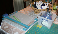
My cutting area has my rotary cutter, Cropodile, and CM cutting system, which are laid out on a quilt cutting mat. For cutting a single oval, the CM cutters are much quicker to use than the Cricut, and so despite numerous dies for the Cuttlebug and cartridges for the Cricut, they are still among my most favorite tools. Now, with my collection of Nesties and Cuttlebug folders, I’ll probably substitute those for the CM cutters when I get ready for this weekend’s “Crush”. Something new that I have to find a spot for is the Scor-Pal, which has become one of my top five favorite tools.

I set the rotary cutter on the corner so I can sweep small scraps right into a trash can. To the left of the cutting area I set out some paper – not a lot, just some seasonal stacks, some pre-scored and folded card backings, and some extra plain white cardstock. On a small step stool (so I don’t have to bend so far to get to it), right in front of the paper area but out of view in the photograph is the plastic file box I store my scraps in. My scrap file is the first place I look for paper before heading to my large organizers, and when I’m cutting, I set new scraps on top for filing during clean-up. If I don’t clean up my areas after each card, my work area rapidly descends into complete and total chaos!

I also set out a basket with my most favorite punches, including the lace edge punches I use the most and some shape punches that I’m likely to use as well – mostly seasonal ones and some corner punches, plus a couple of different sized single hole punches. Yes, I love the Cropodile, but it only punches two sizes of holes. I punch holes for brads with a 1/16th inch hand punch.

Moving around the table, I set up an area to stamp and next to that, an area to emboss. I found a package of two cutting mats for $2 at the grocery store that have proven invaluable at containing messes. These are pretty large – about 18 by 24 inches – and made of very thin, flexible, heavy duty acrylic of some sort. They are designed for chopping vegetables on the counter but I like them because they are a flat, smooth surface that cleans up easily. I am an expert at making a mess so I also lay out wax paper when I am going to stamp a background.

Again, I don’t bring out every stamp I have. Based on the time of the year, the season, I set out some old favorites and some seasonal stamps. I also set out some new ones I was itching to try. I can always go to my stamp cabinet and get whatever I need, but it helps to have a few stamps already in mind and close at hand. I set out a tray of mounted stamps as well as several sets of the unmounted rubber and clear stamps that I use the most. And I gathered together an assortment of acrylic blocks into a flower bowl so they would be handy when I needed them.

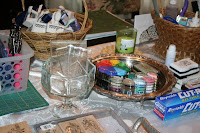
Likewise, with the ink, I set out some of my favorite color stacks, plus the embossing ink, greeting ink, and the stamping inks I use most often. I also set out the embossing powders I use most often as well, along with a tray for the powder and some of the tools I use for embossing.


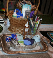
The place where I actually put my card together is recreated from my work table in my studio. I have all of my adhesives, tape runners, Inkessential pens, pencils, ruler, my favorite little detail scissors and tweezers, paintbrushes, Exacto knife, and a mat to work on. In the basket are extra tape refills, glue dots, corner mounts, and adhesive. I don’t want to have to spend precious time on search missions for extra packages of things I’m likely to run out of.


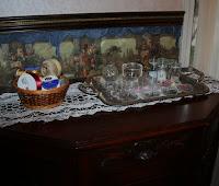
Our china cabinet was the perfect place to put the things I use for finishing touches and embellishments. Again, I chose a selection of ribbons I use most often, plus twine and gold cording since I use those a lot as well. On a tray, I organized brads, eyelets, rhinestones, pearls, beads, and other things, and also set out some of the glitters I use the most. I also have a fishing chest full of buttons and other little accessories that I set down in the corner next to the cabinet. Since my studio is on the lower level of the house, I want to have the things I use the most handy so I can save myself time and energy running back and forth for things.

The last time I set up for a VSN, I think it took me an hour and a half to gather and arrange everything. But that investment of time and effort allowed me to thoroughly enjoy the VSN and to make fully half of the cards without ever leaving this work area. Yes, there will be things you’ll have to get – different stamps, paper, dies and embossing folders – but having the area set up allows you to spend your card-making time very efficiently and for an event like this, where you have time constraints, having things organized and in easy reach helps enormously.

Speaking of “time”, shortly before the VSN starts, I set out a couple of clocks so I can keep track of time and stay on target with the time restrictions. While I have always made a supreme effort to stay within the time limit for the VSN, with the Mini Cabaret, I actually made a note of the amount of time I spent on each card, a habit I’ve carried through with a lot of the cards I now make for the regular challenges. Doing so has helped me to see what kinds of techniques take more or less time and I’ve also become very sensitive to where my time is being “wasted”. I can easily get distracted and a card that takes me “an afternoon” to finish probably only took me an hour, if I take away the time I spent filing paper, talking on the phone, opening the mail, and playing with the dogs. During the last VSN, I got so carried away chatting, there were a couple of challenges where I found myself using much of my “work” time “chatting”. That’s fine – I thoroughly enjoyed the conversations and needed a break from working at that point – but it’s amazing how much time can pass if you aren’t paying attention.
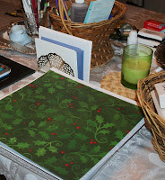
My First Valentine Cards of the Season

The newest stamps from Stampavie are out and several of the whimsical images are perfect for Valentine’s Day. I’ve had so much fun making Valentine’s Cards with them.

The first card I made features two adorable hedgies. Watercolored and then decorated with Martha Stewart’s fine gold glitter, love truly sparkles on this card. The lace edge is done with a Fiskars lace edge punch. I layered a strip punched from the dark red card stock under the punched edge of the card. Before adhering it, I brushed it with gold ink and dusted it with gold embossing powder. A few waves of the heat tool later, the gilt border adds a touch elegance.

These youthful skaters brought back wonderful memories of my youth. I grew up on a pond and ice skating was a favorite winter sport. I used Core’Dinations Vintage cardstock for the background and a scrap of one of the Bo Bunny holiday papers for the large striped panel. Valentine’s Day is a good time to use up some leftover holiday papers. The background was stamped with one of the “Snag’em Stamps” (Flower), from the Imaginisce line.

When making a card with a dark card stock base, I generally add a white panel inside the card to either stamp a greeting or hand write a note. You can quickly and easily add a few simple embellishments and a decorative edging punched from the scraps to make the inside of the card as warm and attractive as the card front.

My favorite of the three Valentine cards I’ve made so far is this one, which features “My Prince Charming”. I used some decorative punches and scrap paper to make the daisies, which are assembled from two punched daisy shapes and a “sun” shape.

I clustered them in front of the frogs, and also embellished the two tall flowers that form the left and right borders of the design. I scattered a few more daisies over the background panel and decorated them with a punched triple leaf.

Monday, January 12, 2009

It's VSN Time Again!

Introducing the VSN – Virtual Stamp Night

The next VSN, What’s Love Got to do With It, is set for the weekend after Valentine’s Day (February 20th and 21st) with the “mini” VSN, the Crush, scheduled for this Saturday. In addition, the creative coordinators of this Love Fest have added an additional “teaser” event to this VSN. The excitement begins with a “flirtation” this Friday at 7 PM, so be sure to tune in (log in to SplitCoast Stampers) for this extra little bit of fun on Friday evening.

If you’ve ever been able to go away to one, Stamping Retreat Weekends are a lot of fun and a real treat. Generally, you go away to a resort or a hotel where you can totally immerse yourself in crafting projects from breakfast to bed. Your food is cooked for you and someone does the dishes, makes your bed, and brings your morning and afternoon coffee. There’s no one barking or meowing, no one to cook for, no housework, no phone, no one asking what’s for dinner, no one calling “Honey, I need you!” or “Mom, I can’t find my [fill in the blank]???”

A Virtual Stamp Night is essentially a virtual retreat weekend, “virtual” being the operative word. We immerse ourselves in card challenges and crafting. We all work together on projects that often have tutorials associated with them that introduce us to new techniques. But while we do it as a group, we all work alone in our own space, in our own homes, and we interact with each other on-line via chat threads. (And no, I have no clue why it’s called a Virtual Stamping Night, since it’s actually two nights plus a mini event a few weeks ahead of the main course. My guess is that it started out as a single night and has just grown and evolved from there.)

VSN can be for anyone. You don’t HAVE to do it all. You can make VSN as much or as little as works for you. At any time during the VSN weekend, you can take the time to do one or a few of the challenges. You don’t need a reservation… all you need to do is log on if and when it works for you.

But for those of us who want to immerse ourselves in a VSN, we usually have to work doubly hard to manage all of the potential distractions around us since we are still at home, still the “Mom,” still chief cook and bottle washer, still the “go to” person in our family. It takes some advance planning to organize our family and our work space in order to be able to “host” a “retreat for one" at home, with “family” going on around us.

Even if you are blessed as I am with a room or a space in your home that is dedicated to crafting, it helps to prepare your work space to maximize your efficiency for the timed challenges which are the hallmark of the VSN. If you don’t have a space set aside just for crafting, you can easily turn any area of your home into a temporary “studio” for the duration of the VSN.

Preparing for a VSN

Preparing for a VSN means preparing both your family and your work area. The “Crush” event this weekend will be a perfect opportunity to test your plan and see what changes you need to make in terms of your family and your physical set up. I have changed how I manage myself and my family with each VSN I’ve participated in.

First, decide how much of the VSN you want to participate in. The key to successful pre-planning is to anticipate and prevent distractions and interruptions during that block of time. Plan ahead to have meals in the crock pot or already cooked and in the refrigerator, or settle on take-out. Decide who is going to be responsible for child care, pet duties, cooking, and clean-up. If young children are part of the equation and you want to try to do the entire VSN, you might consider arranging for a sleep-over at Grandma’s or for a babysitter to come in and help.

If you haven’t already done it, right now is a good time to check over your supplies and make a shopping list so you can restock things you’re low on and that you know you’ll need no matter what the challenges might be, such as adhesives, embossing powder, plain old cardstock, and watercolor paper. A “shopping list” has already been posted on the VSN Forum for this weekend’s challenges, so be sure to check that out and see if there is anything on the list that you don’t already have on hand.

Negotiate an area in your home that will be off-limits to everyone else for the duration of the VSN, a work area where you can spread out your craft supplies and leave them set up for the full two days of the VSN. Check out tomorrow’s blog post for some ideas for setting up an efficient work area in your kitchen or living room.

Thursday, January 1, 2009

Happy New Year!


Happy New Year!! I'm going to start the New Year off with some posts about the most recent cards and scrap book pages I've made.

Christmas is a time of wonderful memories, traditions, decorations, food, and ... GIFTS. The pre-holiday days are filled with shopping and gift-wrapping, the post-holiday days are time time to say "Thank You". Although email has largely replaced handwritten notes (my grandmother would turn over in her grave at the thought), you may want to make some cards for a more personal holiday thank you to the special people in your life.

This week’s challenge at Mothers and Daughters Creations is to make Thank You cards. While I love to labor over T-Y cards as much as any other, if you need many cards to send out after the holidays, you need to keep them simple and quick or you could still be writing thank you notes at the beach! (I don’t think that’s what they mean when they talk about “Christmas in July”.)

I made a pair of quick and easy “Thank You” cards using a wonderful paper from Melissa Frances. “Gracie” is a winter themed paper in non-traditional colors – gray, a very subtle sage green, and a touch of lavender… one of my favorite color combinations. The colors in “Gracie” are very subtle: the olive is more gray than olive, and the lavender is mostly found in the distressing. But it’s an effective way to add color and the same color matting brings your eye to it immediately.

I used Core’Dinations card stock for the color base and matted my greeting in the same card stock. I love Core’Dinations, especially the Nostalgia collection. The colors are just the right shades to go with most vintage patterned prints, and they include gradients of each color in each pack. That makes monochromatic mats a breeze. They’re on sale now at MDC: http://www.mothersdaughterscreations.citymax.com/CoreDinations_CardStock.html

The greeting is from the Snag’em Stamps by Imaginisce – most of these stamps are only a dollar. (Here’s a link to the entire collection of them at MDC: http://www.mothersdaughterscreations.citymax.com/Imaginisce_Stamps.html) I painted the flower on the greeting with water color pencils adding just a hint of lavender and olive.


I used Martha Stewart lace edge punches to add some elegance and chose two completely different style ribbons. For the more sophisticated card matted in gray, I paired a more formal lace edge with a gray satin ribbon. For the card with the more flowery lace edge, I used a wispy wired edge organza, a bargain at MDC as well for ribbon this wide. You can see it here: http://www.mothersdaughterscreations.citymax.com/catalog/item/6622142/6489103.htm

The finishing touch is a row of dew drops. I was wishing I had them in the right shade of lavender but decided that clear added just the right touch without taking away from the gorgeous paper.

If you need to make some holiday thank you’s, visit the blog at MDC for some more absolutely stunning ideas and submit your cards to this weeks’ challenge! (Here’s a link to the blog: http://mdcchallenges.blogspot.com)